Hand-Drawn History: How Don Smith’s Artwork Helped Shape the Co-op
By Beverly Faxon
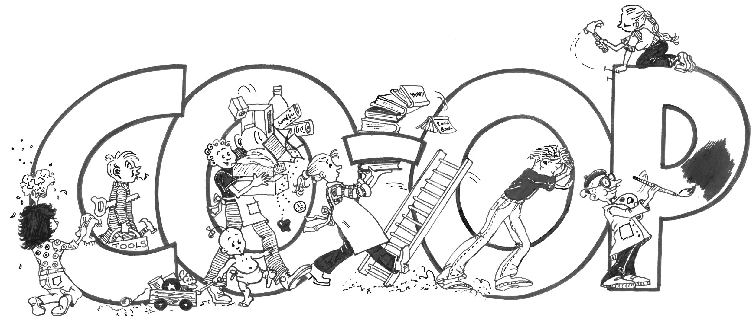
Sorting through a box of Co-op memorabilia, I uncovered treasure: a stack of drawings with the distinctive signature of “DAS.” For years, starting in the 1980s, Don Smith created graphics, cartoons, and logos that were the artistic face of the Co-op.
Don designed the iconic Co-op logo when the store moved from Pine Street to First Street in 1985. The logo was hand-drawn, of course: valley, trees, river, the “Skagit Valley Food Co-op” script that predates a menu of computer fonts. His work graces the store awnings, and he also did the original 1988 Deli Next Store logo, as well as the logo on our red brick exterior, declaring the three story, block-long structure to be the Co-op Building. That colorful mural of vegetables above the produce case? Don.
Looking through Don’s drawings, a mix of beautiful pen and ink work and funny cartoons, brought back years of artwork he supplied for The Natural Enquirer. As editor, all I would have to say was, “It’s time for the Earth Day tree giveaway, can you bring us something?”, and Don would.
A classic illustration of Don’s “begrudge-no-detail style” shows two people buried behind their newspapers, over a breakfast table set with everything from a honey pot to salt and pepper shakers, their beverages of choice before them; one humming “I love coffee”, the other “I love tea” in thought bubbles floating overhead. Their newspapers are replete with columns and scribbles of writing, even inked photos. The wallpaper is a complex stripe and dot pattern design, the tablecloth painstakingly checked. The cartoon takes up an entire 11 by 14 inch page. At first glance it is flawless, until I note a careful patch smaller than a postage stamp—some error of a hand curled around a coffee cup, carefully redrawn and covered. Somehow this patch just makes the picture more perfect, a seamless repair I’d never even noticed.
In December 1992, the Enquirer ran two articles—one was “Confessions of a Chocoholic (and Some Actual, True Facts about Chocolate)”. The other headline read “Why on Earth Would Anyone Buy . . . Carob?”
An aside: carob enjoyed popularity in the 70s, 80s and early 90s, when it was billed as a healthy, delicious chocolate substitute, which turned out to be a disservice to both products. Eventually, it was largely acknowledged by anyone not trying to get their kids to eat it as not in the least delicious. I note a New Yorker article titled “How Carob Traumatized a Generation,” and I’m afraid my son might have written it.
I asked Don to illustrate these two side by side articles, and he came up with one of my favorite Don interpretations: A carob Easter bunny and a milk chocolate Santa, both wriggled free of their foil wrappers, wrestling each other to see who would be the victor. It was light and silly and perfect.
Says Todd Wood, General Manager during those years, “The work Don did for the newspaper—that human touch, and that Gary Larson-esque fun twist—you have to think that they were a reflection of Don’s personality. I’d take things to him to get worked on, and then watch him—how fast he was. Years later, watching him on a computer, he was still so fast. It was amazing.”
Every spring, Don illustrated the issue featuring board elections, and somehow repeatedly put a fresh spin on the topic. One of my favorites, from 1986, shows Don’s trademark detail: a long table, with 14 board members in attendance—all in front of open briefcases (of course not a laptop or iPad in site, just pencils and paper). Both men and women are wearing ties and suits, including the fellow in the foreground, who also has a beard, a ponytail, a broad smile, and a big carrot held between his fingers as though it is a cigar.
Don’s holiday illustrations capture candlelight and coziness. Once I asked for a set of elves, and Don sent ten, in a range of poses. They were beautifully designed to cozy up to a bit of text, snooze on top of a headline, or point excitedly to a featured product. I used them shamelessly for years, highlighting every December issue.
When I look back at the original graphics I have from Don, I also love the frequent penciled marginalia with some version of, “I’m sorry I was so late, and I hope it didn’t foul up your schedule” or “The rest will be here in the morning.” Don himself smiles over this, saying if he got something done before midnight of the deadline day, he figured it was still on time.
Yet, there is additional context here. Without email, without digital graphic tools, without scanners, the only way to deliver these carefully hand-drawn pictures was to get in a car and drive them to the Co-op, handing them over in a stiff protective portfolio. For many years, that was how we defined “sharing files”—you give me the work, and then we sit down for some coffee.
Last fall, I met with Don at his home up valley, just a few miles from Rockport State Park, where he worked as a senior park aide from 2015 until his retirement for health reasons last spring. We spread out the old Co-op artwork on a picnic table, and Don was off and running with stories—about particular drawings, about his early days as an artist, about his love of both art and the Skagit Valley. Don is a lover of tangents, and to sit and talk with him is to get drawn into stories as delightfully detailed as his art.
He reminded me that one of the first things he ever did at the Co-op was painting the holiday windows, always the day after Thanksgiving, before he eventually handed that task over to fellow artist and Co-op employee Cathy Schoenberg. He used a style that he later employed to good advantage in Europe when he was backpacking and low on money.
Don says, “My cousin introduced me to shopkeepers, and I offered to paint their windows. And their response was ‘Why would I do that? I want people to look in and see my wares.’”
Don demonstrated how his paintings created little snow-frosted windows and doorways where you could peek through to see the jewelry or cookies or toys for sale inside.
His payment from at least one store was a shopping cart filled to the top with whatever he needed. Says Don, “I had no warm clothing, so I filled it with moon boots and sweaters.”
When I asked Don where he grew up, he replied, joking, but also a little serious, “I don’t think I ever did grow up.” It turns out, Don was born in Hollywood, and this birthplace, known for its stories and images, somehow fits just right.
When he was four or five, his dad, also a graphic artist, got a job in the art department at Boeing, and the family moved to the Seattle area. Don got an art degree from Western Washington University, as well as a teaching certificate. He wanted to be both an art teacher and a gymnastics coach, and eventually he served as an assistant coach for the Mount Vernon girls’ gymnastic team.
While still in school, he took a job with the fire crew at the Baker River Ranger Station, working as a summer firefighter. He loved working up in the Cascades, and put himself through school without his parents “having to spend a nickel.” As a graduation gift, his parents paid the fee for him to do a gymnastics workshop in Hawaii. But Don preferred to return to his fire crew in the Skagit, see his friends, and fight fires. So, he asked his parents for a point and shoot camera to replace the gym fee.
He had no yearn to travel, until a friend told him about camping in Europe, visiting museums and cathedrals. Somehow, he got “bit by the bug” and in response, right before turning 22, he made arrangements to head over the ocean, while he could still get a student fare as a 21-year-old. He knew nothing much about Europe, although, he says with a grin, “I had seen a ground plan of a cathedral and knew who was buried there.”
Don spent eight months in Europe, mostly broke. But he had an art box he’d built himself for oil paints, and he’d set up with all his gear in a European town, “I didn’t sell much art, but people would see me on the street, and they’d invite me home, give me a meal.”
When he came home, he pursued life as a graphic artist, working with Cascadian Farm as well as San Juan Graphics, which was owned by a retired crop duster pilot. Don grins at the juxtaposition between his two employers, one a pioneer in organic farming, the other asking him to do cartoons and covers for AG Pilot International.
Don kept working for Cascadian Farm, and eventually, in 1990, became Art Director for them, and later for Small Planet. He had first made his mark for Cascadian Farm years earlier by designing the label for their newly developed strawberry jam. In all, he spent over 35 years working in some capacity for the Cascadian Farm brand.
When I visited Don, he was having a gallery show in Concrete, where he also has outdoor murals on display. As we sat in the yard he shares with his wife Cherie and son, amid bunches of dahlias and gardens with fences of curving branches, the mist lifted. I saw just how close we were to Sauk Mountain, and I thought how perfect it is that Don is enjoying the landscape he came to love as both a firefighter and an artist.
Later, he texted me a photo of himself out on Highway 20, with a hand-drawn cartoon thumb, fully three feet long—the thumb labeled Concrete. I had to laugh—it is a classic, and classy, way for Don to hitchhike between towns up valley, now that he no longer drives.
Before I left, Cherie spread out a beautiful quilt crafted for Don by Sarah Huntington. It features graphics from the many t-shirts he has designed over the years, for scores of valley happenings, businesses and causes: Concrete Good Olde Days, Sauk Mountain Pottery, School of Urban Wilderness Survival, Support Mountain Rescue, Cascadian Farm’s 25th Anniversary, the Skagit Valley Tulip Festival.
Don’s iconic DAS signatures, his artistic creations, and his irrepressible cheer leave their mark all over the valley, and nowhere more than the Co-op. His imprint of characters and cartoons, good natured and whimsical, rife with wordplay and puns, definitively original, helped shape the Co-op into a place known for friendliness and good will.


